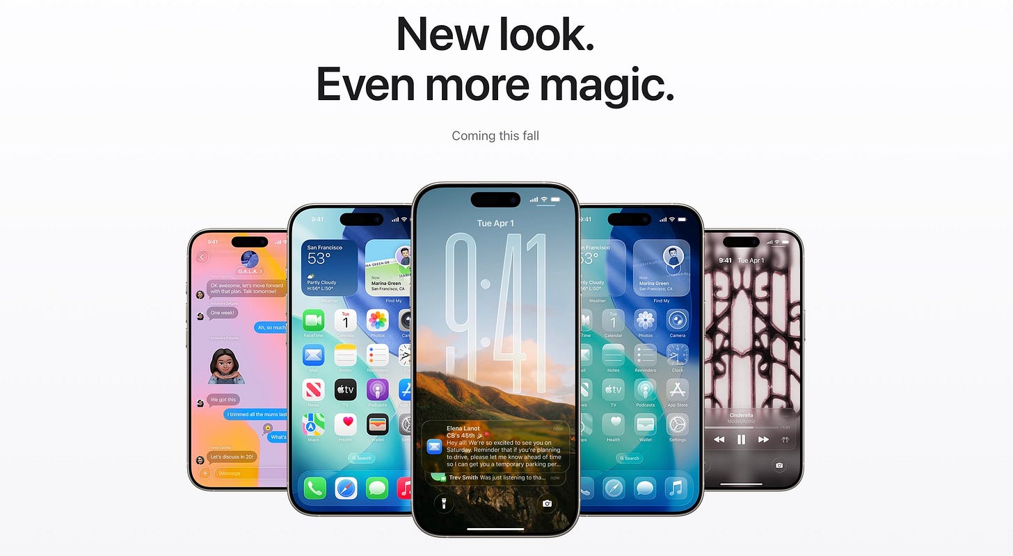
On Monday, Apple unveiled the first major redesign of iOS since iOS 7 in 2013. And it’s not just coming to iOS. “Liquid Glass” is being thoughtfully adapted across all of Apple’s operating systems releasing this fall. As the name implies, it heavily relies on UI elements that look like real glass. Icons look as if they’re constructed of three-dimensional glass elements. As you slowly pull down the lock screen, you see the widgets and icons on your home screen distort beautifully as if you’re really pulling a thick piece of glass over them, causing the light to refract around the edges.
It’s caused a lot of mixed feelings from everyone who has seen it. Several people have confidently and snarkily retorted, “Steve Jobs would never have allowed this to ship.” I think those people are wrong. I think Steve Jobs would have loved Liquid Glass. I know that’s a bold claim, and I actually think people are often way too casual in proclaiming what Steve Jobs would have loved or hated all these years removed from his death in 2011. Had he lived through the years since then, we really have no way of knowing for sure what his thoughts might be about any of the things Apple has done.
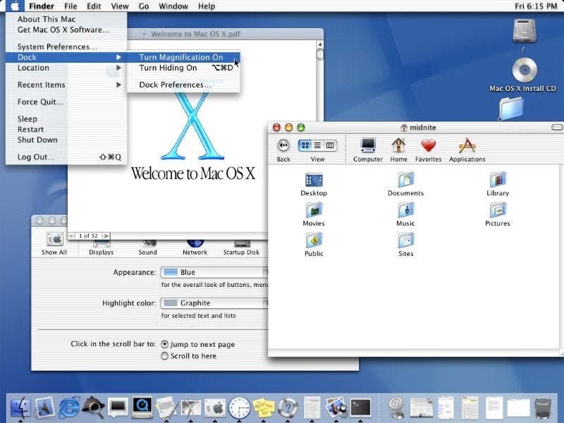
I first got into Apple products not long after Steve Jobs returned to Apple in the late 90s. And when Steve Jobs unveiled the Aqua user interface for the original release of Mac OS X, it was a jaw-dropping moment. No computer operating system had ever had a UI that was so fluid and realistic. Steve himself described the icons as “lickable.” Just look at this gorgeous thing:
Aqua is still my all-time favorite Apple UI work, and it had a lot of elements that Liquid Glass is learning into. Look at the almost transparent Dock. And the translucent Apple menu that you can see a Finder window behind. And look at how the buttons in the title bar of the front-most Finder window appear tangible, colorful, and liquid. Like a gelcap pill. Apple’s new Liquid Glass interface is very much a return to some of the thinking that went into Aqua a quarter century ago. That is why I’m so confident that Steve Jobs would be a fan of what Apple’s cooking in 2025.
That doesn’t mean I love everything about Liquid Glass. There are clearly some rough edges in the first betas of Apple’s new operating systems. Many have pointed out how visually cluttered Control Center on iOS looks now. There’s so much transparency that it looks garish and jumbled. But there’s all summer for Apple to work on refining Liquid Glass, and I’m confident that they will have meaningful improved the worst elements of this by the time the operating systems ship this fall.
I’m also not in love yet with the way the glare appears around the border of clear, round elements in iOS 26, again very present in the current iteration of Control Center. And while my 14-year-old son was very excited about the option to turn all of your icons and widgets clear, I will almost certainly never use that. I like having vibrant colors in my Apple OSes.
But the parts of Liquid Glass that work, work beautifully. So beautifully that you want to just sit and scroll and move elements onscreen just to see how buttons and floating tab bars react. It’s been a while since a new UI from Apple has caused that kind of surprise and delight.
Your Apple Update is a reader-supported publication. If you enjoy this publication, please consider becoming a paid subscriber.


Thanks so much, John. I love Aqua, too.