
This simple setting change makes full-screen mode on the new MacBook Pro much better
The new MacBook Pro’s “notch” affects the way full-screen windows work, and frankly I don’t care for the default behavior. Here’s how to make it better.

Apple introduced full-screen mode for windows in macOS a decade ago with its Lion operating system. Full-screen mode is essentially an extension of Apple’s Spaces virtual desktop system introduced to macOS two years prior in Leopard. When you click on the green traffic light in the upper-left corner of a window that supports full-screen mode, the window is given its own space, takes up the entire screen, and hides the title bar and window controls. In 2015 Apple enhanced full-screen mode further with the introduction of split view, which allows you to have two separate windows sharing a space in full-screen mode. Personally, when I’m using my MacBook Pro with two external displays, I like to keep Microsoft Teams and Mail open in a full-screen split view, and essentially dedicate one of my two external displays to just that.
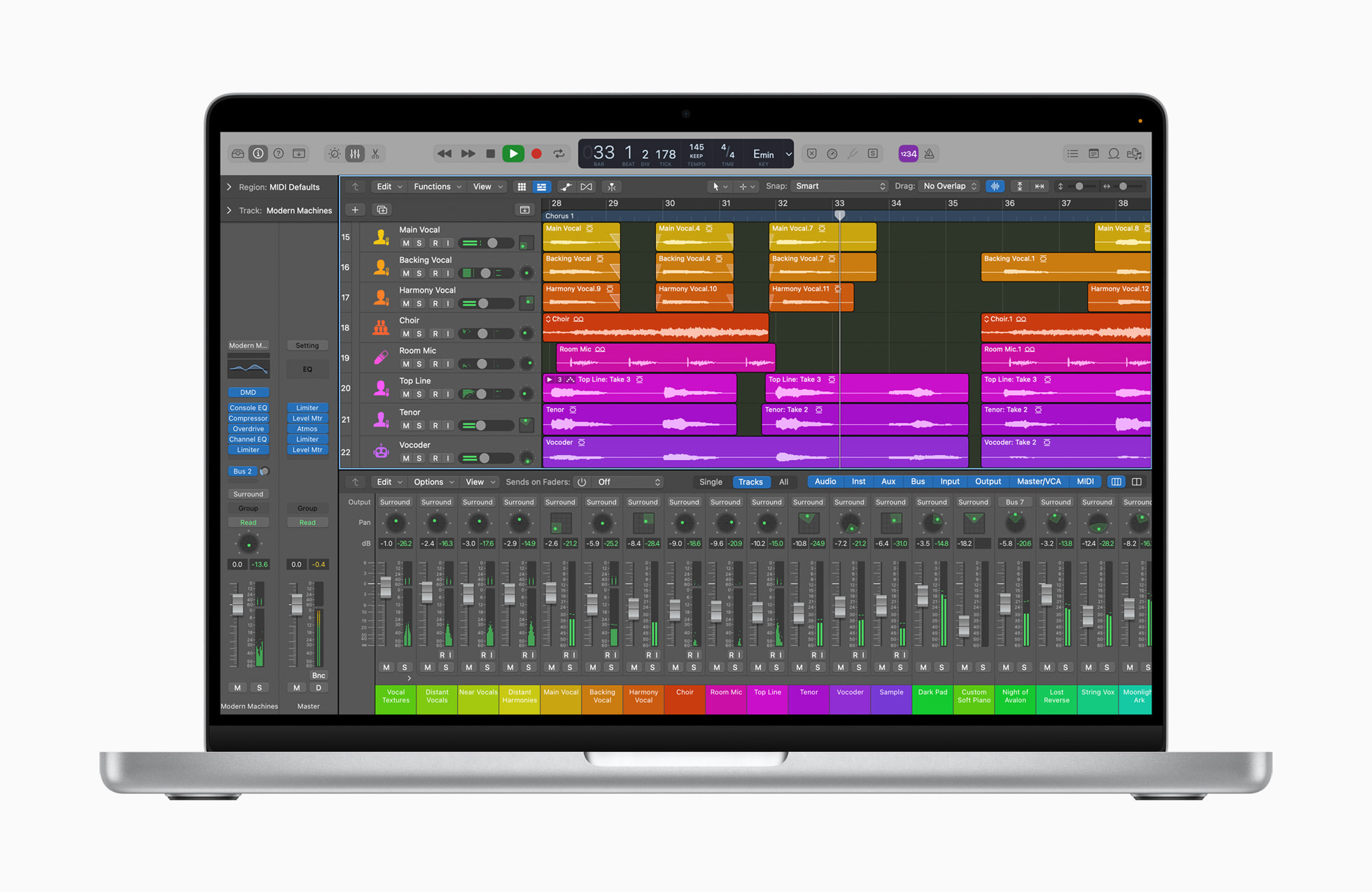
With the newly launched M1 Pro and M1 Max MacBook Pro, Apple has incorporated the “notch” for the camera housing similar to the notch that has been on the iPhone since the iPhone X in 2017. In practice it’s not at all a problem as it sits in the middle of the menu bar, which is typically empty anyway. When you take a window to full-screen mode on the new MacBook Pro, it only takes the top of the window as high on the screen as the bottom of the menu bar, leaving the entire top of the screen a black bar. Because the Liquid Retina XDR Display has such great black levels, the notch completely disappears, and it just looks like the top of the window is where the screen ends and the bezel begins. This is essentially the way full-screen mode has always worked because the area below the menu bar has the same 16:10 dimensions as the entire display on the previous MacBook Pro. All of the area on either side of the notch is actually new screen real estate that didn’t exist on previous models with their large top bezels. You can see an example of the default full-screen mode in Apple’s image above, showing Logic Pro in full-screen mode on the new MacBook Pro.
But frankly, it bugs me that all of this perfectly good screen real estate goes to waste when you’re in full-screen mode. I’d much rather see the typical menu bar content at the top of my screen. Fortunately Apple gives you that option without having to venture dangerously into the Terminal and entering a command you copied and pasted from a questionable website. Just go to System Preferences > Dock & Menu Bar, and uncheck the checkbox next to “Automatically hide and show the menu bar in full screen” at the very bottom of the window. After doing that, your full-screen windows will look like this:

One of the purposes of full-screen mode is to provide a distraction-free work space, so you could argue that bringing back the menu bar betrays that intent a bit. But one of the other purposes of full-screen mode is to give you as much space as possible with your current window, in much the same way an iPad window uses the full screen. And since the area above a full-screen window on the new MacBook Pro adds to, rather than takes away from, the 16:10 workspace that’s always been there, it doesn’t rob from the full-screen mode experience.
Your mileage may vary, but I like this way of using full-screen mode on the new MacBook Pro much better than Apple’s default mode.