The one thing about Apple’s retail stores that has always bugged me…
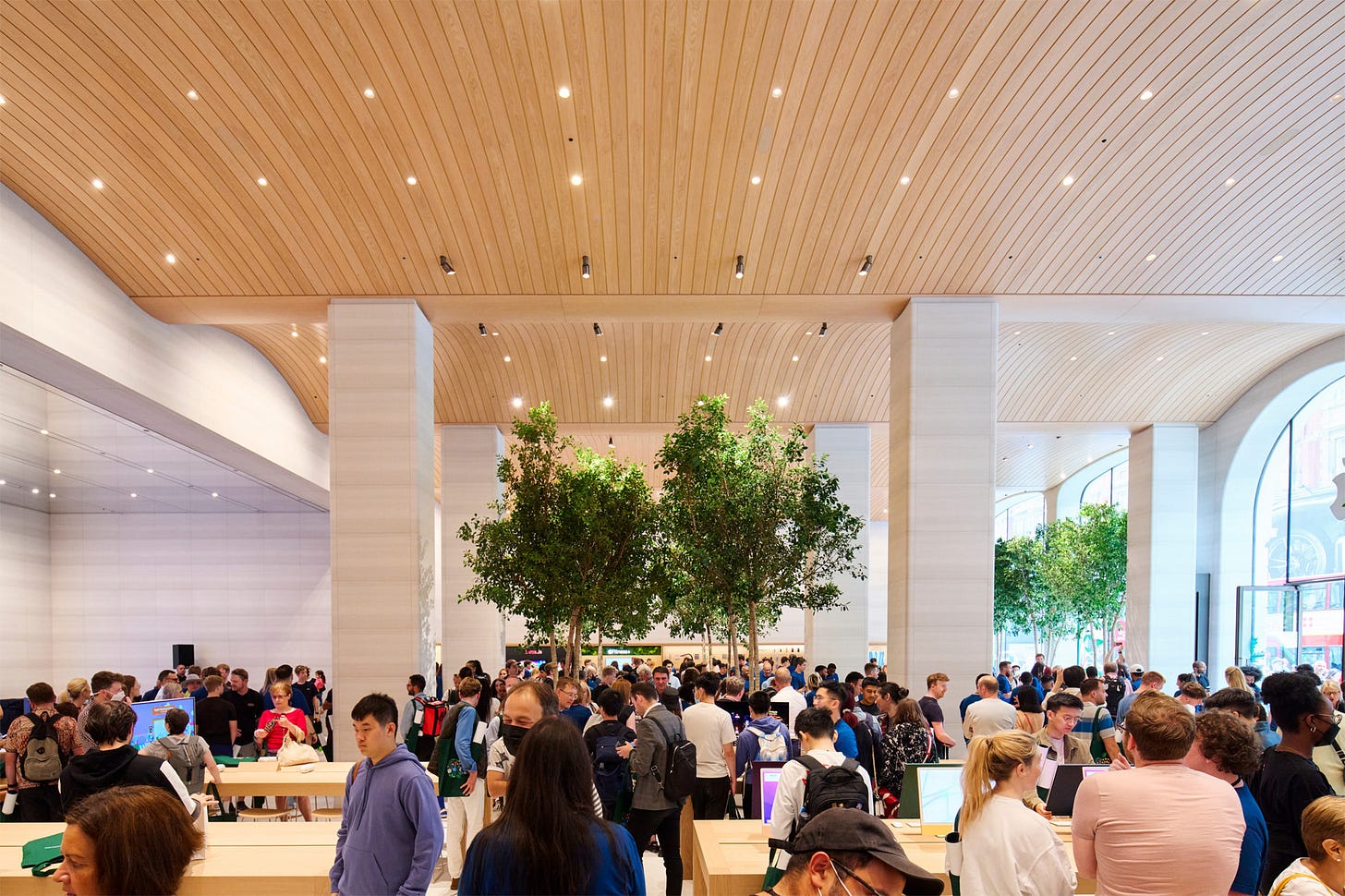
Apple’s stores are fantastic places to browse and shop for Apple products and accessories, but there’s one change that they made that misses the mark.
Last week I wrote about The Apple Store Time Machine, a fantastic Mac app built in the style of a first-person video game that lets you virtually walk around four of Apple’s retail stores as they appeared on their opening dates, including Tyson’s Corner, the very first Apple Store which opened in 2001. This week John Gruber of Daring Fireball had Michael Steeper, the creator of that app, on his podcast The Talk Show where they discussed Steeber’s creation of that app, as well as a deep dive into Apple’s stores in general. It was a great episode, particularly for veterans of Apple Retail like myself. Toward the end, Gruber brought up one of his pet peeves about Apple Retail that has always been one of mine as well: the lack of a dedicated place to make a purchase.
For those who haven’t spent much or any time in an Apple Store, there is no dedicated point-of-sale (POS) counter. When you want to buy a product, you have two options: flag down an available Apple Store employee who can ring you out using an iPhone-based mobile point-of-sale system, or use the Apple Store app on your own device to scan a product’s bar code and check out without even speaking with an Apple employee. (I suspect very few of Apple’s customers are aware that the latter option even exists!)
But it wasn’t always that way. The earliest Apple Stores all did have dedicated point-of-sale counters like you’d find at any other retailer. I was part of the team of Apple employees who opened Apple Green Hills in 2005. It was Apple’s first store in Nashville, Tennessee. Like most of Apple’s new stores of the era it was a “30-foot store,” meaning that the width of the store was 30-feet. It had a (small by today’s standard) Genius Bar along the right side wall in the middle of the store, and along the back of the store it had a long point-of-sale counter. The “cash registers” themselves were three 17-inch G5 iMacs with cash drawers beneath them. In between each of the three iMacs there were swing-out stands tucked under the counter that each featured a 15-inch PowerBook G4. These were for times when there were a lot of people wanting to check out at once, but were used infrequently in practice. At least some of the larger 45-foot stores had their point-of-sale counters at the front of the store. (If you explore Tyson’s Corner or Apple Fifth Avenue in The App Store Time Machine app, you’ll see these dedicated check-out counters.)
So what happened? It’s easy to blame the iPhone and the massive influx of new customers that it brought into the Apple Stores starting in 2007 for changing Apple’s store layout and store design philosophies, and that’s certainly true. But the seeds of change had been sown well before the iPhone came onto the scene. In late 2005 Apple Stores began incorporating the first iteration of Apple’s mobile point-of-sale experience. But these were far from the iPhone-based solutions that Apple employees use today with slick, Apple-designed software. The first version of was based around large, clunky Symbol mobile computers. If memory serves they ran a version of Windows Mobile. They had a terrible physical keyboard and a flimsy stylus that supported Palm’s “Graffiti” handwriting recognition software. I never owned a Palm device, so I never learned Graffiti, but I knew some Apple employees who used it frequently with these mobile check-out devices.
I think those of us working in Apple Retail at the time saw this as a great solution for helping alleviate long lines at the point-of-sale counter. While some employees manned the counter, others could grab other customers waiting in line and get them checked out quickly. But even early on Apple corporate was quick to message to Apple employees that mobile point-of-sale wasn’t a “line-busting” solution, but instead represented a new way of doing business in Apple Retail.
Apple moved pretty quickly to eliminate the dedicated point-of-sale counter from all of its retail stores. Apple Green Hills was remodeled in August 2007. After the remodel, the P-O-S counter was gone, replaced by a longer Genius Bar at the back of the store. I’ve always regretted Apple’s decision to remove the counter, and at the time I argued my case in vain with the Apple corporate employee who facilitated some training for us while the store was being remodeled. But of course she was really in no position to do anything other than state Apple’s reasoning. She wasn’t in a decision-making position and the decision was long-made. But sometimes you just want to make your voice heard.
Make no mistake, I think mobile point-of-sale was an innovative solution and so is self check-out in the Apple Store app. These are great things that enhance the experience of shopping in an Apple Store, and they’ve helped change the way retail works industry-wide, especially since COVID. But the fact remains that humans are accustomed to going to a dedicated place to line up and make a purchase, and it’s disorienting and frustrating when a customer doesn’t know where to go or who to see to complete their Apple Store experience so they can be on their way. Even for someone like me who well-knows how the process works, it’s frustrating. Even though I know that any Apple employee I see can ring me up, I still have to find someone who is free (often an impossible task) or else I have to line up behind whichever customer the employee is currently helping. In a typical point-of-sale experience you expect your turn to come fairly quickly since all that’s happening ahead of you is a series of transactions. But in an Apple Store, you might be waiting behind a customer who is asking a series of detailed sales questions. That kind of indeterminable waiting can be downright infuriating.
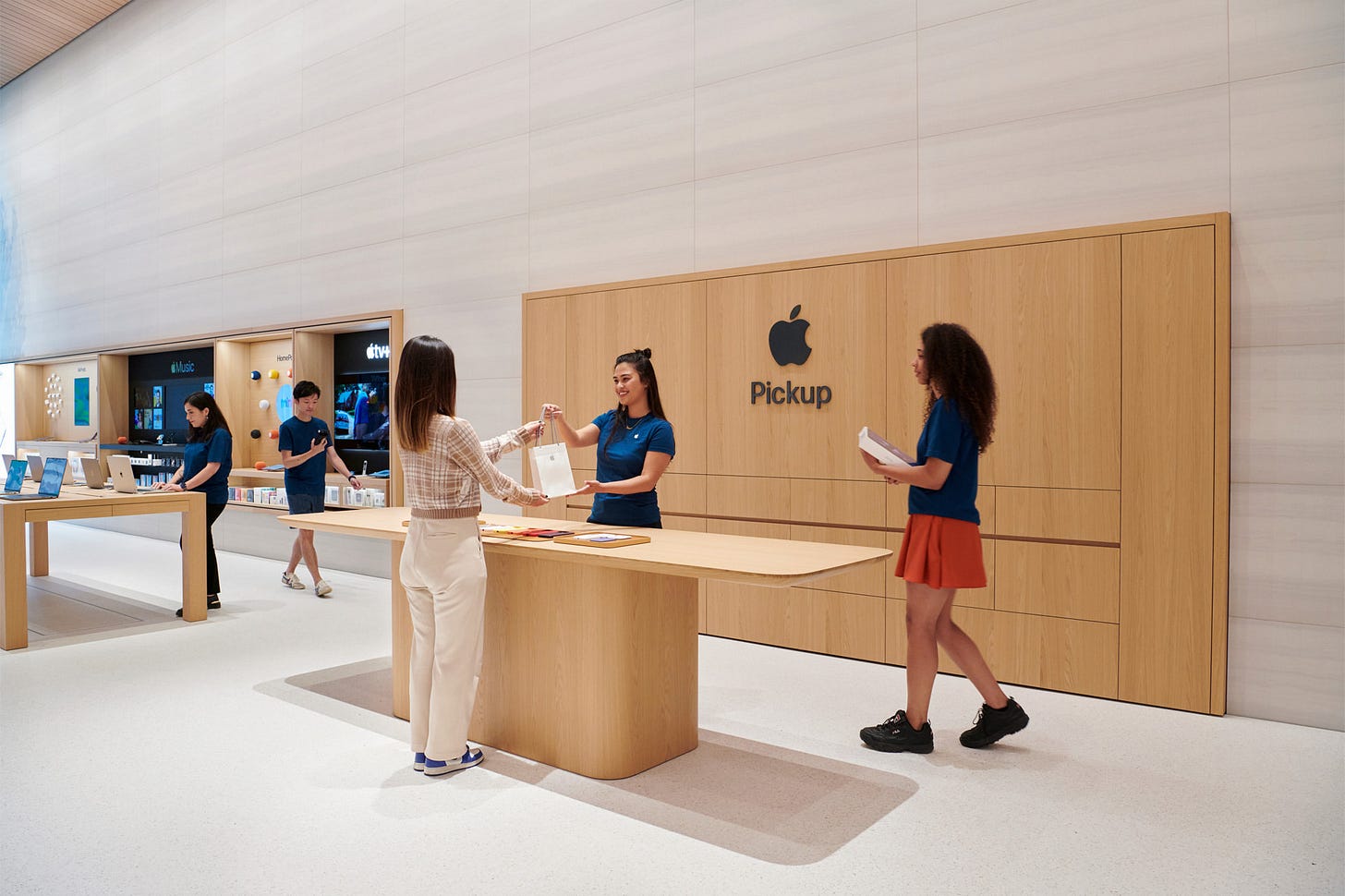
I am glad to see that Apple is bringing a type of point-of-sale counter back in the form of dedicated Pickup stations, like the one in the photo above. This a specific place in the store that you can approach to pick up a product that you’ve already purchased online. Unfortunately it’s not a point-of-sale counter for purchases made within the store, though I’m sure employees stationed there will be equipped with mobile check-out devices. But it’s at least a turn back in the direction of a dedicated cash wrap location.
At the end of the day, it’s certainly not a huge deal that the point-of-sale counter went away. Apple Retail has done nothing but grow substantially since the time in which that decision was made. And Apple has certainly introduced industry-changing ways to make purchases in their stores, exemplifying the “think different” motto. But Apple also shouldn’t be making it a confusing and frustrating experience to make a purchase. Yeah, it’s been 15 years, but I guess I’m still not over the counter getting taken away. 😂


Stores need signs to educate people to use their own device. Everyone is a til now!
At my local Apple store, there is an “Express” counter. This handles pickup orders as well as walk up purchases for accessories and other products that do not need to be brought out of the back like the big ticket items. This means that customers don’t have to find someone to help them check out, because there are always multiple people at the counter ready to ring customers up.